


 New Code Sent!

We caught up with Jessica McConnell, Director, Whirlpool Colour, Finish & Material Design and Brittni Pertijs, Lead Colour, Material & Finish Designer for KitchenAid to discover the story behind the annual colour of the year.
THE COLOURFUL WORLD OF KITCHENAID
Colour has been at the heart of the success of the KitchenAid brand since first launching colour products in 1955.
The Colour of the Year provides an annual opportunity to connect with Makers on a deeper and more emotional level to inspire creativity and open possibilities.
The KitchenAid Global Design team is responsible for selecting the Colour of the Year. The lengthy process of identifying and creating the Colour of the Year takes roughly eighteen months. To start, the team takes an exhaustive look at sociocultural trends, and because the team is global, there’s high-level input from every corner of the world on food, design, fashion, and more.
The trends are then studied and vetted before the team gathers with two or three topics and colour options balanced against the KitchenAid colour portfolio.
McConnell describes how they consider the emotional power of colour to help make meaningful colour selections: “Colours are so emotional – what kinds of colours will people want to fulfill an emotional need they’re having at the time.”


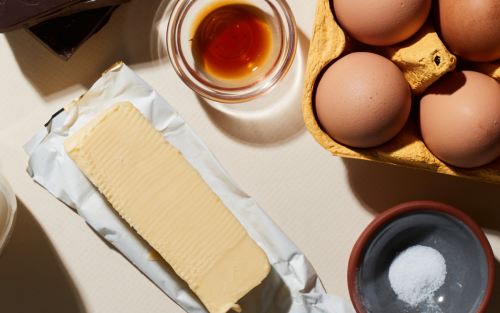
Butter, the 2025 Colour of the Year, was designed as an invitation to savor life’s simple, heartfelt moments.
“Our team saw yellow continually pop up, and knowing we wanted to tap into comfort and nostalgia, this felt like the perfect marriage of all those elements.”
BRITTNI PERTIJS
LEAD COLOUR, MATERIAL & FINISH DESIGNER, KITCHENAID
BONJOUR, BUTTER
Butter is the latest Colour of the Year, chosen for its soft, energizing yellow and finished with creamy satin and available only on KitchenAid.ca.
The KitchenAid team first considered the colour when mustard became popular in 2019. They kept an eye on the trends until it became clear. Brittni Pertijs, Lead Colour, Material & Finish Designer for KitchenAid, wanted to explore comfort and nostalgia, explaining that: “the colour yellow has the ability to transport you back in time, evoking some of the warmest memories.”
The colour might remind some of the iconic looks of kitchens in the 1950s or 1960s that were often decorated with a similar soft yellow. Butter echoes the kitchens of the past while feeling modern and fresh, reflective of present-day design trends—a classic neutral that will endure.
To land on the perfect shade, Pertijs recounts that when “creating Butter, we bought a lot of different yellow samples to create a range of options. One of those samples was, ironically, a vintage butter knife we found in an antique shop.” The team worked closely with their paint partner to explore various shades of yellow until the nuances were just right. “From there,” Pertijs continues, “dialing in the finish was important—it had to evoke that creamy and indulgent smoothness that butter has.”
The colour delivers a sense of delight to a space, allowing us to experience the past while reconnecting with the present.
Pertijs encourages everyone to explore with Butter in their design: from contemporary and clean to eclectic and traditional style, the Butter Stand Mixer complements muted tones like sage green or shades of blue, like periwinkle or Blue Velvet.


Blue Salt, the 2024 Colour of the year, is designed to ignite positive and fresh new perspectives as it shifts in the light.
“We have a lot of fun trying to push and pull colours in different directions and see how far we can take them…”
BRITTNI PERTIJS
LEAD COLOUR, MATERIAL & FINISH DESIGNER, KITCHENAID
BEHOLD: BLUE SALT
2024’s Colour of the Year was Blue Salt, KitchenAid brand’s first-ever “living colour,” exclusively available on KitchenAid.ca.
Pertijs and team knew instinctively that they wanted a blue tone. While the team had been following a fairly warm colour space for years, Pertijs explains: “We felt it was time to shift cooler…to reflect tones of nature like air and water. One image we drew a lot of inspiration from was a butterfly wing that revealed blue iridescent tones.”
For Blue Salt, the team employed a technique, known as nail polish, they hadn’t with past Colour of the Year selections. “We knew we wanted…an iridescent finish, so we began layering different shades of blue with chromatic nail polishes,” says Pertijs, until they achieved their ideal shade of periwinkle blue with a subtle, iridescent reddish-pearl finish.
The colour is meant to evoke fresh, positive, and new perspectives as it subtly shifts in the light. Pertijs reflects that: “We want people to slow down and feel excited and optimistic by the whimsical tone. It’s a subtle sensory reminder to see every day in a new light.”


Hibiscus embodies the energy-boosting hues seen in contemporary art, pop culture and design.
“Hibiscus empowers the inner maker to explore.”
BRITTNI PERTIJS
LEAD COLOUR, MATERIAL & FINISH DESIGNER, KITCHENAID
RADIATE JOY & A LOVE FOR LIFE WITH HIBISCUS
2023’s Colour of the Year was Hibiscus. It was partially inspired by the intersection of the rising global resurgence of maximalism with colour, including bold prints.
Pertijs and team explored the trajectory of pink over the last few years, starting with Millennial pink, and arrived at something bolder for 2023’s Colour of the Year. She said: “Hibiscus embodies the energy-boosting hues we are seeing in art, design and pop culture right now…For us, Hibiscus empowers the inner maker to explore. We hope people feel that way when they see the colour.”
Pertijs also saw Hibiscus as a colour that can “play” with others: “Hibiscus can be styled in so many ways. We love pairing Hibiscus with a neutral kitchen to add a pop of colour. Or, we love a maximalist pink and green combination! Don’t be afraid to pair Hibiscus with various textures as well.”


Beetroot, the 2022 Colour of the Year, was designed to tap into the confidence to re-emerge into the world.
“It’s both earthy and comforting, but also vibrant and full of energy and possibility…”
Jessica mcconnell
Director, Whirlpool coloUr, finish & material DESIGN
UPROOTING THE ORDINARY WITH BEETROOT
The 2022 Colour of the Year, Beetroot, was an opportunity to tap into the heart of 2022.
McConnell reflects on how in 2022, we were all still seeking comfort and spending more time than ever in our homes, but the idea of emerging into the world, or nature, was really taking over. She and her team loved how this root – which is pulled out of the earth into the world – symbolized this innate desire to reemerge.
“We wanted that to come through with the colour – this idea that it’s both earthy and comforting, but also vibrant and full of energy and possibility…” says McConnell.
You must be confident to take that step forward, and the team found that confidence embodied in the rich purple of Beetroot. KitchenAid tweaked the colour to make it not only confident but restorative and uplifting.


Honey, the 2021 Colour of the Year, addresses the emotional need for maintaining connections in a complicated time.
“The story we wanted to talk about was people caring & showing empathy for each other & reaching across aisles, or reaching across differences to make the world a better place, to build a brighter future.”
Jessica mcconnell
Director, Whirlpool coloUr, finish & material DESIGN
celebrating sweetness with honey
The team knew they wanted to tell a story of connection and empathy for the 2021 Colour of the Year. The uplifting, rich and comforting colour with golden-orange undertones was reminiscent of the sweetness that comes from making together in the kitchen and a celebration of those connections and the warmth they bring.


Kyoto Glow, the 2020 Colour of the Year, was designed to turn the kitchen into a refreshing sanctuary where makers could recharge and replenish.
achieving balance with kyoto glow
The 2020 Colour of the Year was inspired by the quest for balance, tranquility and wellness in our homes. It was a wish for health and wellness that grew more relevant as the year went on and the pandemic began. The bright colour recharged and replenished yet was soft enough to provide sanctuary from the demands of life.


The inaugural Colour of the Year, Bird of Paradise, embodied an exotic getaway in colour as it evoked a lush, tropical adventure.
escape with bird of paradise
Bird of Paradise was the first KitchenAid Colour of the Year. It’s a high gloss vibrant coral inspired by the tropical plant and selected specifically to ignite the desire for freedom to travel and explore exotic destinations.
Each KitchenAid Colour of the Year taps into an emotional need the world is experiencing, tempered by trends while also telling a human story; one that continues to build year over year.

“...Tell me a story and it will live in my heart forever…”
Jessica mcconnell
Director, Whirlpool coloUr, finish & material DESIGN
telling a story through colour
Selecting the Colour of the Year to ensure it taps into the current emotions is a multi-faceted decision.
The team notes that the choice is driven by the colour space and whether or not it is a story the world is ready to hear. Ultimately that story will always feature an optimistic spin and charged with energy and action because, as McConnell explains, “...that’s what we’re about, making and action in the kitchen.” She goes on to discuss the importance of storytelling through colour: “...Tell me a story and it will live in my heart forever – that’s what we’re doing here, through colour – these kinds of things are what people ‘bookmark’ in their hearts and minds. Even if they don’t buy that colour, or they buy a different colour, it’s a moment where they can see that side of the brand and they can experience an emotion and be inspired.”
McConnell reflects how colour creates the vibe you want to feel while in your kitchen: “...That’s why we have so many colours, so you can choose. Everyone has a different perspective and something different they want to say. We think of a stand mixer as a throw pillow or exclamation mark in the kitchen. It celebrates who you are. It shows your personality...and it should inspire you to make or do something you love in the kitchen.”


A series of images of yellow items, showing how hues like Butter can come to life in the kitchen.
Dreaming in coloUr
The team is already deeply entrenched in creating next year’s Colour of the Year. So what does the future of colour look like for KitchenAid? The team had this to say: “...Our vision for the future is to make these colours even more human-centered as a design team and think even more deeply about the cultures of people and feelings and how we can bring more of the Maker into our stories.”
The next Colour of the Year is a well-kept secret known by only a few select team members. But one certain thing is it will have heart and soul and will inspire people to dream about how they want to tell their story. And KitchenAid will be right there to help them tell it—in bold, beautiful, hopeful colour.


Savor the Moment with Butter
Inspired by the most lovable ingredient of all, Butter is an indulgent, joyful colour that acts as an invitation to savour life's simple heartfelt moments. Add a touch of Butter to your life and transform everyday experiences into something truly comforting.
recipes


Related Articles
-
 How to Use Honey: 21 Surprising Ways Explore many more ways to make use of honey beyond just drizzling it on top of things. Examples include honey butter and whipped honey. See full list here.
 -
 Stand Mixer Buying Guide KitchenAid® offers a world of possibilities to help every Maker explore their culinary passions. Our iconic Stand Mixer sits at the center of it all.
 -
 Butter Conversion & Measurement: The Complete Guide Whether you wish to convert the amount of butter from sticks to tablespoons to cups to grams or ounces, this butter measurement chart can help simplify your cooking and baking.


